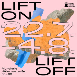
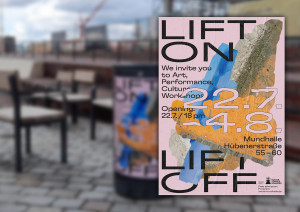
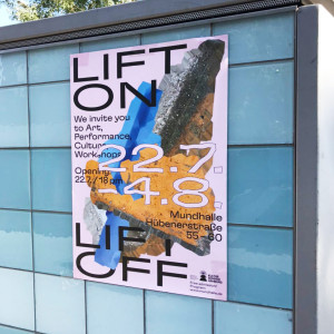
Lift On Lift Off
Lift On Lift Off
Campaign Design, Brand & Identity, Motion, Print, Social Media, 2021
Visual Concept /w Káschem Büro
The materiality of the event location. Translating Site-Specific Elements into Visual Identity.
Design of a coherent identity for the event »LIFT ON LIFT OFF«. Colour palette, typography and graphic elements ensure recognisability and clarity.
The choice of colours reinforces the identity of the event and connects the location with the visual language of the campaign. The colours of the 3D-scanned concrete barriers and containers reflect the surroundings of the event location.
This combination emphasises the construction site atmosphere, the overseas logistics and the temporary character of the event location.
The process of loading and unloading container ships (»Lift On, Lift Off«) as the central motif of the event builds a bridge between the Port of Hamburg and the cultural landscape opposite.
Staggered font arrangements and overlapping fragmented forms symbolise the stacking and reloading of containers as well as the performative and processual character of the event.
The choice of the variable font GT Flexa is inspired by container handling. The angular, clear font and the block-like structure refer to the harbour infrastructure and the movements of industrial processes.
Cross-media campaign consisting of analogue and digital media. Poster, brochure and digital assets that promote the event online and offline.
Clear hierarchy in typography and layout design, making important information (date, location, programme) immediately visible.